Want to maximize the visibility and sharing of your social media posts? Here is one quick tip that is sure to help: use an image.
Yes, it’s as simple as that.
While there are many reasons a social media post performs better than another, a quick way to help it along is to add an image. And the stats back this up.
Social Media Image Stats
“When people hear information, they’re likely to remember only 10% of that information three days later. However, if a relevant image is paired with that same information, people retained 65% of the information three days later.”
-Source: Brain Rules
“Tweets with images receive 150% more retweets than tweets without images.”
-Source: Buffer
“There are more than 1 Billion Instagram users active every day.”
-Source: Instagram Business
“Facebook posts with images see 2.3X more engagement than those without images.”
-Source: Buzz Sumo
The range of platforms covered by these stats proves that this tactic isn’t just a one-trick pony.
When you consider that there are not one but three major social media platforms based on the popularity of sharing images: Instagram, Snapchat, and Pinterest, you have to admit that as a plugged-in society, we are mad about images!
It makes sense, too. Images are easy to glance at and understand. When an image catches our eye, we are able to analyze and deconstruct it faster than words. Our brains are literally wired to process visual things faster. It’s how we evolved. In fact, when we read words, we’re not just recognizing letters and turning those into understandable language. Our minds attribute pictures to specific words or sounds. In that way, we’re able to understand what the word means.
My Personal Take
While writing an in-depth Facebook post or Twitter threads can help you engage and connect on a deeper level with the people who want to learn more, sharing an image with a short caption can help you gain a wider audience, faster. If audience growth is your goal, then this is a tactic you should try.
What Kind of Images?
Before we get too far into the tool I’m going to show you, I need to explain what type of images we’re talking about.
One of the easiest types of images to produce that will resonate with a wide number of people are quote images. These are images with a quote overlaid over some kind of a background. Often, you will see an image in the background, but you can also use solid-colored backgrounds, or gradients, or any design that calls attention to the words, rather than the background elements. Below are three examples. These are all from Instagram, but they work equally as well on the other platforms.
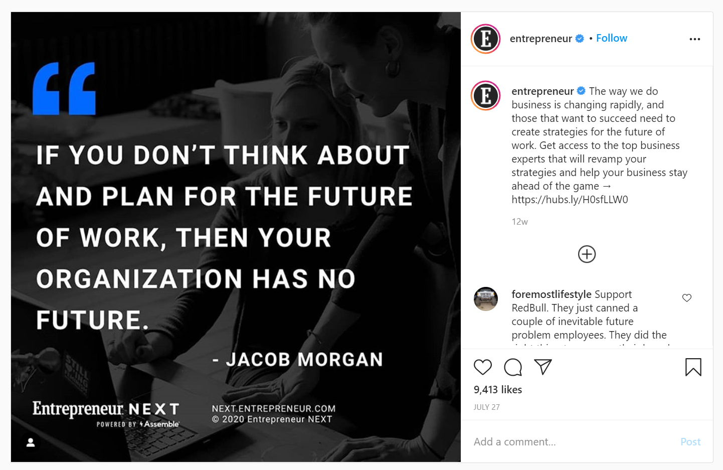
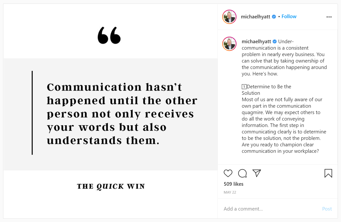

Creating these “quote images” will allow you to broaden your audience more effectively than sharing brand images. Why? Because they resonate with more people. You can use this tactic to show off your philosophy and pull more people in. It’s tantamount to leading with your hobbies or interests at a business mixer, rather than what product you sell.
The Tool: Pablo by Buffer
Pros
- No copyright issues (if you use the images provided by Pablo).
- Easy to Get Started
- Dead simple to use
- Can Share Right From the App
Cons
- Desktop only (no mobile or app version)
- Has only a few features
- Cannot skip beginning tutorial (if you haven’t accessed it for a while or if you access it on a new browser)
Copyright Issues
Before we get too far into this tool, I have to discuss the invisible elephant in the room: copyright issues. I’ve written before about being careful you choose an image which isn’t going to land you in hot water over copyright issues. Overlaying words over a photo doesn’t change that.
You still have to make sure you’re using a free-to-use image or paying for the correct type of licensing if it’s a paid stock photo.
Luckily, Pablo, the tool I’m writing about today, provides a way to search through a site of free images, so you don’t need to worry about it.
Introducing Pablo
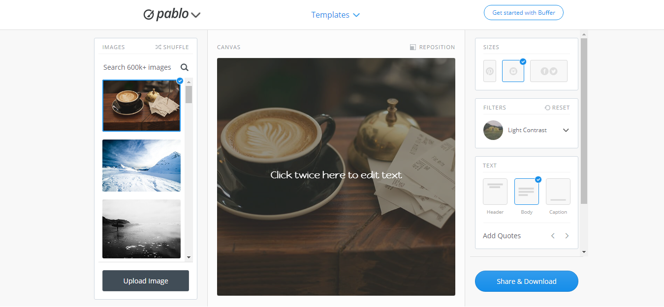
Choosing Images
Your first step is to choose an image, and choosing the right one is half the battle. You want to choose a photo that portrays your message, or at least doesn’t detract from it.
Here’s what I’ve noticed, though. Many people use a lot of the same or very similar images to express what they want to say.
Have an inspirational quote? Why not layer it over an image of a beautiful mountain peak wreathed in clouds? Unfortunately, many people use this formula, and it only works some of the time.
I am just as guilty of this and it’s easy to do. After all, you’re in a hurry. Do you really have time to sort through a ton of photos to find one that is absolutely perfect?! Maybe not…
However, taking a few extra minutes to choose a photo that not only compliments your message, but is also unique will ensure that your image and message are more likely to stand out from the crowd.
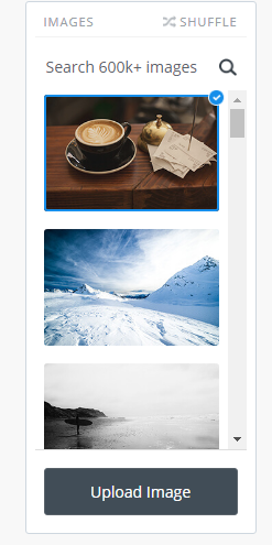
Pablo gives you two ways to choose images. You can choose images from the free stock photos on the left or upload your own image. If you use the free stock photos, Pablo allows you to search by keyword or shuffle them if you just want to see more random images.
Fonts/Design
Now comes the fun part: adding your quote/words over the image and making sure everything looks right. That’s not fun, you say? Well maybe it’s just fun for me, then… 😉
If you want to overlay a quote over the image, this is the time to do that.
Just slapping some text on the photo isn’t enough, though. You’ll want to spend a few minutes tweaking the settings so that it looks right. Don’t forget to make sure that your text is readable. Below are some tips on that.
Start by clicking on the left and right arrows beside the “Add Quote” words. This will rotate through common quotes.
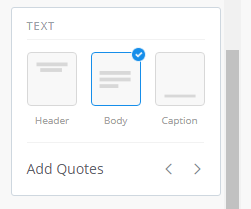
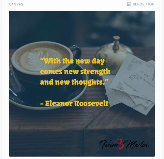
I’ve chosen a quote by Eleanor Roosevelt, which seems appropriate to not only the image, but something that I want to say today.
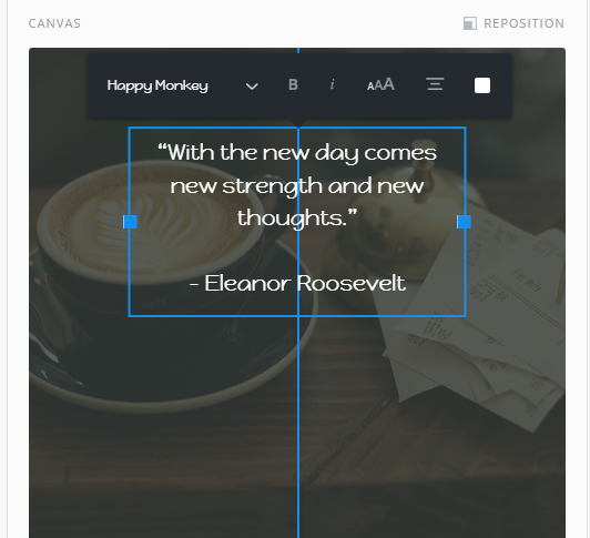
Once you have some text on there, you can start to play around with the options. They are not immediately apparent, as you have to click on the text to make them appear.
You can change the font family, size, boldness, alignment and color. You can even put your own text by selecting the text that is there and typing or pasting in the replacement words. In this way, you can customize your text to fit a certain mood, or just make it look more readable. You can also move the text around by clicking and dragging. As you’re moving the text, you will see blue lines appear both horizontally and vertically to indicate whether you have aligned the text perfectly. Below is a screenshot where you can see that I have the text aligned perfectly center and also how different the overall image looks when you play around with these settings just a little bit.
Now that you have your words the way you want them, it is time to tweak your image settings so that it looks really nice. First up, is adding a logo or other graphic, if you want. Many companies use this feature to brand their images so that people seeing them across the internet can identify the image with their business. If you want to do this, start by clicking on the words “Insert Logo or Graphic” and choose your logo or another small branding image from your files. You will likely want to use a logo with a transparent background (either in a .png or .gif format).
![]()
Once you add your logo, you can move it around by clicking, dragging, and dropping it in the spot you want.
![]()
You can also resize the logo with the slider buttons, but you may need to shift it a little bit, as making the image larger tends to move it around.
![]()
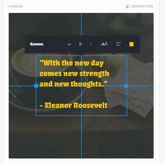
The next way you can dial your image in is to use filters. There are only a handful, but they can make a big difference in the way your image looks. You can find them to the right of the preview image with the rest of the settings.
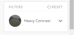
Click on the down arrow beside the current filter that’s selected to see all choices. You can choose from.
- None
- Light Contrast
- Heavy Contrast
- Light Blur
- Heavy Blur
- Grayscale
- Blur Grayscale
- Blue Tint
- Red Tint
- Green Tint
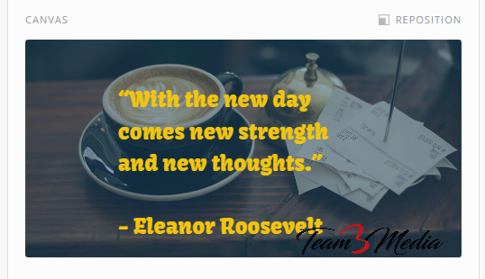
I chose the blue tint option and I like the contrast of the blue with the yellow letters. Don’t be afraid to play around with the options until you like what you see.
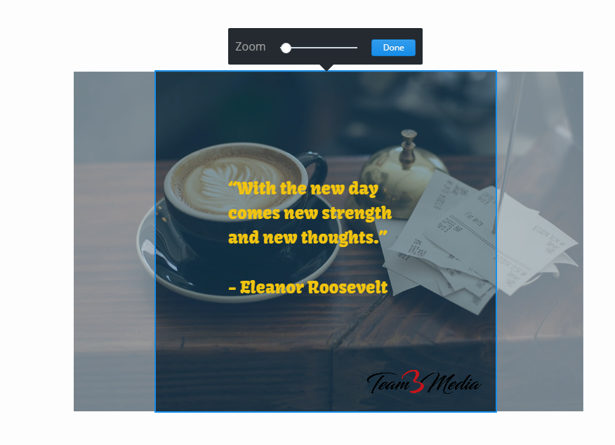
You can also reposition the photo. This is found at the top of the image preview or canvas area. Click on “Reposition” to bring up the tool and drag the photo around, or zoom in or out until you are satisfied. Press “Done” to save the changes.
Sharing to Social Media
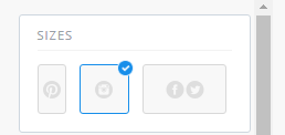
The last thing to do is export it for the different social media platforms. This is where I feel Pablo really shines. With just a couple of clicks you can instantly resize your photo and export the perfect size for the main social media platforms. I have Instagram selected as my first option.
When I click on Twitter and Facebook as an option, you can see my text is slightly running into the logo on the bottom right. I just need to do a few quick tweaks, either by moving the words or logo slightly or making them smaller to make it all fit. Depending on your setup, you may need to do more.
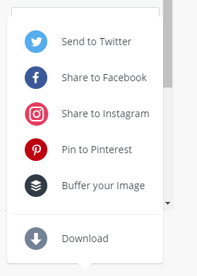
Just remember that when you start moving things around, it will save it. So get the elements where you want them then click the “Share & Download” button on the right. Pablo gives you several options to either share directly to social media platforms, import the image into the Buffer site, or download for later.
I’ve been using Pablo and other tools for a while to create quick shareable social media images. Over the years, I’ve learned some design tips to help make these types of images perform better.
Tips to Make Your Images Look Better
- Use light words over a darker background, or vice versa.
- Use the blur tool to bring your words into greater focus. Be careful with this, though… you can blur your image so much that it’s unrecognizable.
- Choose a readable font. Yes, readable. Readable is always preferable over “cute”. Afterall, you want your users to actually read the text right?
- Use your company logo on images to Brand them. You never know where your images will end up, as people share them across the internet.
What You Can Use This For
- Instagram posts. Instagram is for pictures, after all. 😉
- To flesh out your weekly content.
- To promote a promotion, sale, blog post, etc.
Now get out there and create some easy to share images that will delight your followers and get you more engagement!
- Closing My Email Lists - December 14, 2021
- No More [Random] Location Tagging from Third-party Apps to Facebook and Instagram - November 25, 2020
- How to Create Quick Shareable Social Media Images [Tutorial] - October 20, 2020